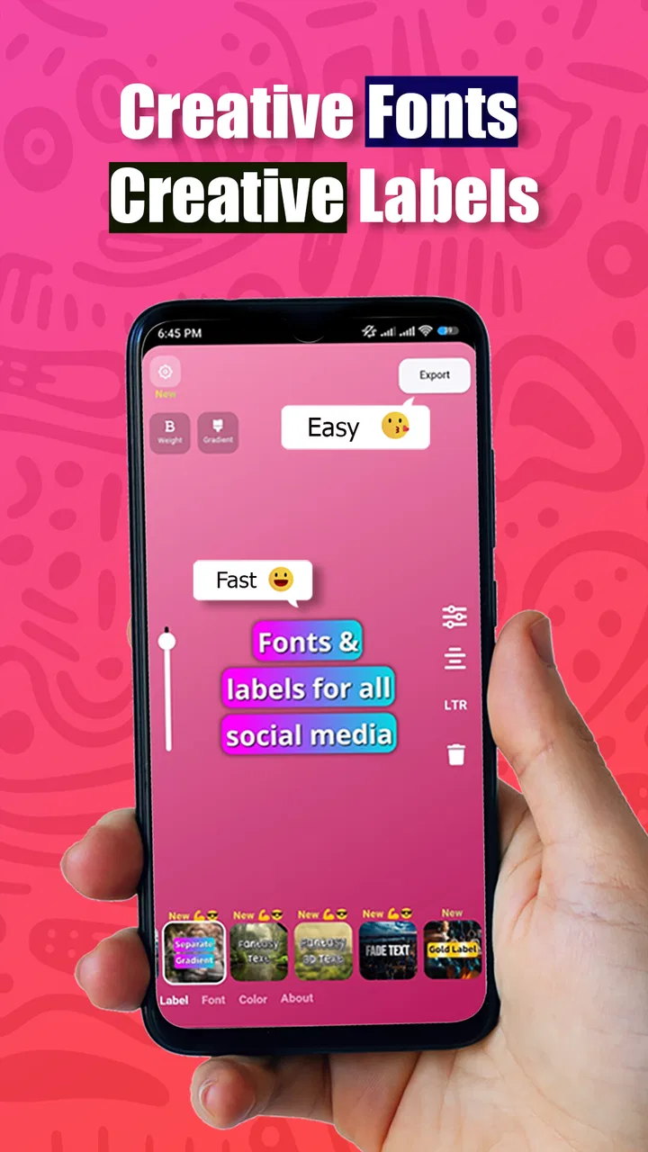
Fonto - story font for IG
- 4.6
- Rating
- 1.00M
- Installs
- Free
- Price

 Analysis by App-foxy
I tried Fonto as a quick way to give Instagram and WhatsApp stories a more personal look, and its appeal became clear almost immediately: it focuses on the part that many social editors make unnecessarily complicated, which is adding readable, attractive text. It is a free art and design app from ZEEBAVERSE LLC (Apps), aimed at creating story images rather than replacing a full photo editor. That narrower purpose is important. If you want fast typography for a photo, it can be useful; if you expect a complete design studio, you may find its boundaries sooner.
The app has reached over a million installs and holds a 4.6 average from around ten thousand ratings, which suggests that its basic workflow has connected with a broad audience. I would still treat popularity as context rather than proof that it suits everyone. My own experience is that the value depends on whether you enjoy making small visual decisions yourself: choosing a type style, adjusting placement, and deciding how much text a story can comfortably carry.
What using Fonto feels like in everyday story creation
The most natural use case is a photo that needs a short message before you share it. I can imagine opening it after taking a picture of coffee, a street view, a birthday moment, or a simple product snapshot, then turning that image into something more deliberate without building a multi-layer design from scratch. The store summary centers on beautiful stories for Instagram or WhatsApp, and that matches the app’s practical role: it is a focused text-and-image tool for social posts.
You May Also Like

 Blood Strike: 2.5 Anniversary
Blood Strike’s Loadouts Turn Every Drop Into a Tactical Gamble
A close look at Blood Strike’s custom loadouts: how fast access to signature weapons reshapes its battle royale rhythm, rewards preparation, and narrows the gap between fights.

 Pandora - Music & Podcasts
Pandora’s Music Is Easy to Start, but Harder to Recover
Pandora’s strength is its low-effort path from a seed to a station. Its weak spot is how much confidence it asks you to place in connection, setup, and quiet recovery.

 8 Ball Pool
 Is Built on Rivalries, Rematches, and Routine
A close look at the rivalries, rematches, shared routines, and unanswered safety questions that turn a quick pool match into a persistent mobile community.

 Samsung Music
’s Quiet Strength Is Playing What You Already Own
Its reach comes less from spectacle than from dependable access to a personal library. That simplicity is both the app’s strongest retention engine and its ceiling.

 AccuWeather: Weather Radar
AccuWeather Review: A Quick, Clear Forecast for Everyday Decisions
For everyday plans, the best forecast is the one you can understand quickly. AccuWeather makes rain timing, radar, and local conditions easy to act on, with a few trade-offs.

 Hill Climb Racing
Why Hill Climb Racing Still Turns Crashes Into One More Run
A tiny car, a bumpy hill and one more upgrade: Hill Climb Racing keeps resurfacing because its simple chaos makes every near-miss feel personal.
More From Our News Desk



That focus also makes the first decision easier. Instead of beginning with a large blank canvas full of unrelated options, I approach the app with a specific question: what should the words add to this image? A short caption can provide context, while a single phrase can act almost like a headline. I found that the best results come from treating the text as part of the composition, not as an afterthought pasted over the picture.
For a realistic daily workflow, I would use it before leaving for an event. I might select a photo, add the location or a brief invitation, test two contrasting type treatments, and save the version that remains readable when viewed quickly. This is where a dedicated story-font app can feel faster than a general editor. I do not need to search through tools intended for detailed retouching, drawing, or advanced image correction.
The app is also suitable for people who are not comfortable with design software. You do not need to understand layers, masking, or typography terminology to get started. The important choices are visible in the act of making the story: the words, their position, their visual character, and how they sit against the background. That approachable structure is one reason I would recommend trying it before committing to a more elaborate design platform.
Why the focused approach works
Compared with a full design suite, Fonto feels less intimidating because the goal is narrower. Large alternatives often offer templates, illustrations, brand controls, animation, photo corrections, and many export decisions. Those tools are stronger when I am preparing a campaign or a carefully planned announcement, but they can slow me down when I only want a polished story in a few minutes.
Compared with the built-in text tools inside Instagram or WhatsApp, the advantage is the chance to approach typography with more intention. Native editors are convenient and perfectly adequate for a casual note, but their text treatment can feel predictable. A separate app encourages me to prepare the visual before opening the social platform, which helps when I want the image itself to carry a consistent mood.
There is a trade-off, though. Moving between apps adds a step. I have to prepare the story, save or share it, then continue in Instagram or WhatsApp. For a message that only needs a basic caption, the built-in editor remains quicker. I would choose Fonto when the text is central to the image, not automatically for every story.
Small choices that make a noticeable difference
One useful habit is to write the caption before experimenting with decoration. Long wording quickly exposes the limits of a small story canvas, while a concise phrase gives the design room to breathe. I also prefer checking the text against the busiest part of the photograph rather than placing it where there happens to be empty space. A quiet area may look attractive in the editor but become less effective once the image is viewed at a glance.
Another practical technique is to design for the final viewing environment, not just the phone screen while editing. Social stories are often viewed quickly, and bright photos, thin lettering, or crowded backgrounds can reduce clarity. I would make a deliberately plain version first, then add personality only if the message remains easy to read. Readable text is more valuable than decorative text, especially when the story is meant to communicate information rather than simply create a mood.
I also found it helpful to separate the visual job of the photograph from the job of the words. If the image already has strong colors or a busy subject, the lettering should usually be calmer. If the photo is simple, the type can carry more of the personality. This is not a special effect or hidden shortcut; it is the kind of judgment that makes a focused typography app worthwhile instead of turning every story into a collection of competing elements.
Trust, controls, and moments that deserve attention
Because Fonto is used to prepare personal photos and social content, I would not judge it only by how attractive the finished story looks. I also want to know what I am choosing before I bring an image into the workflow, what happens when I share it, and whether I can keep control of the final result. The app is free, carries an Everyone content rating, and supports in-app purchases ranging from under a dollar to around fifteen dollars per item. That makes it easy to try, but I would still pay attention to any purchase prompt and confirm what I am selecting before approving it.
The current version is 4.3.0, and it runs on Android 7.0 or later. Those details matter for practical trust as well as compatibility: I would check the operating system on an older phone before planning to use it for an event or work post. On a supported device, keeping the app updated is sensible, particularly for an editor that handles images and may change its interface over time.
When an app works with photos, I prefer to make deliberate choices rather than grant access automatically. I would select only the images needed for the current story, review the Android permission prompt carefully, and avoid importing a whole library simply because it is convenient. The same principle applies when sending the finished image to another service: I would check the destination shown by the sharing screen and make sure the correct account or conversation is selected.
Those habits are especially important for private material. A family photo, an unpublished product image, or a screenshot containing personal details should be treated differently from a public landscape. I would prepare sensitive content only when necessary, remove accidental information from the composition, and inspect the final image before posting. A typography editor can make a picture look finished while leaving the underlying privacy mistake untouched.
What I would verify before relying on it
I would start with the visible permission requests on my own device, because those are the controls I can directly review. If the app asks for access that does not seem connected to selecting or creating an image, I would pause and reconsider. I would also look at the app’s account and purchase screens before beginning a larger project, especially if the workflow offers optional paid items. The safest approach is to understand the choice at the moment it appears rather than assume that “free” means every part of the experience is included.
I would also keep the original photograph separate from the edited story. Working from a copy protects the source image if I later change the design, and it gives me a clean fallback when I want to reuse the photo in another context. This is a small workflow improvement, but it matters more than it sounds: social designs are often revised after seeing them beside other posts, and preserving the original prevents one quick experiment from becoming permanent.
Sharing deserves its own check. After creating a story, I would review the preview, confirm the wording, and make sure there are no unintended details near the edges. If the app passes the image to another application, I would treat that handoff as a separate decision and verify where it is going. I would not assume that preparing an image and publishing it are the same action.
Where user agency is strongest, and where it is limited
The strongest control is the creative one. I decide what text to add, which photo to use, and whether the result feels appropriate for the audience. That makes Fonto more comfortable for users who want to make their own choices instead of accepting a fully automated template. It is also useful when the message is personal enough that a generic design would feel out of place.
The limitation is that a focused editor cannot make every design decision for me. If I am unsure about spacing, contrast, or hierarchy, I still need to judge the result. A template-heavy service may be better for someone who wants a ready-made layout with minimal experimentation. Likewise, a professional design application is more suitable when I need precise brand colors, repeatable layouts, detailed image correction, or a complex multi-page project.
I would skip this app when my priority is speed above all else and the built-in social editor already does what I need. I would also look elsewhere for advanced motion graphics, extensive collaboration, or a complete content calendar workflow. Fonto makes the most sense in the middle: more intentional than a basic in-app caption, but lighter and less demanding than a full design environment.
Who should try it
I think it is a good fit for casual creators, students, small sellers, travelers, and anyone who regularly wants to turn a photo into a cleaner story without learning a large creative suite. It can also help someone develop a personal visual habit: using short wording, leaving breathing room, and choosing typography that supports the image instead of overpowering it.
It is less convincing for users who expect every design element to be automated or who need professional production controls. The free entry point makes experimentation easy, but optional purchases mean I would not assume that every desirable item is included without checking the screen in front of me. That is not a reason to avoid the app; it is a reason to approach it as a try-first tool rather than promise it will replace every other editor.
After using it, my cautious recommendation is straightforward: try Fonto when your stories need better typography and you are willing to spend a little time making visual choices. Its strongest quality is focus, and its main weakness is the same focus because it does not aim to be a complete design studio. I would keep the original image, review permissions and purchase prompts, inspect sensitive content before sharing, and compare the finished result with the simpler built-in editor. For supported Android devices, the app from ZEEBAVERSE LLC (Apps) is a practical free starting point for story design, provided you value control and readability more than an all-in-one feature list.
FAQs for Fonto - story font for IG
01What is Fonto and how does it enhance Instagram stories?
Fonto is a versatile app designed to enhance your Instagram stories by providing a wide array of unique and stylish fonts. It allows users to personalize their text with different styles, sizes, and colors, making stories more visually appealing and engaging. Perfect for influencers and brands looking to stand out.
02Is Fonto free to use, or does it require a subscription?
Fonto offers a free version with basic features, but for access to premium fonts and additional customization options, a subscription may be required. The app provides in-app purchases to unlock these features, allowing users to decide if they want to invest in the enhanced creative tools.
03How user-friendly is Fonto for beginners?
Fonto is designed with user-friendliness in mind, making it accessible for beginners. The interface is intuitive, with easy-to-navigate menus and straightforward tools. New users can quickly learn to apply different fonts and styles to their Instagram stories without needing prior design experience.
04Does Fonto offer any unique features compared to other font apps?
Yes, Fonto stands out with its extensive library of fonts and customization options. It offers unique features such as custom font uploads, advanced text editing tools, and the ability to save custom templates for future use. This sets it apart from many other font apps available on the market.
05What are the compatibility requirements for using Fonto?
Fonto is compatible with both Android and iOS devices. It requires a relatively recent operating system to function smoothly. Users should check the app store for specific OS version requirements before downloading to ensure compatibility and optimal performance on their devices.
Pros
- Wide variety of stylish fonts.
- Easy to use interface.
- Seamless integration with Instagram.
- Regular updates with new fonts.
- Customizable text options.
Cons
- Limited free font options.
- Requires in-app purchases.
- Ads can be intrusive.
- No offline mode available.
- Occasional app crashes.

Fonto - story font for IG
Gallery